8 ways to get shoppers to follow through on a purchase
The industry standard for conversion across all e-commerce sites is around two percent. That means that 98 percent of people who visit your site don’t buy anything. And just a lowly 10 percent of visitors ever add something to the cart. It’s no wonder most companies only capture 5.3 percent as actual sales.
With these numbers, even factors that only affect one one-hundredth of your conversion rate can have massive impacts on your revenue. Some of the steps below may seem small, inconsequential, or obvious but it’s important to think these through in order to capture shoppers and ease them through the checkout flow to become a sale.
1. Telegraph your checkout is legitimate and safe
On the internet, it’s hard to tell professional stores from the sketchy ones. The suspiciously cheap brands from China feel to-good-to-be-true but look like any other fast fashion e-commerce site. While the prices are enticing, buying from them can feel like a gamble. Customers worry about their information getting stolen.
To combat confusion, make sure your store presents itself as a trusted, legitimate brand. Have a domestic phone number and clearly display an email for customers to contact. Proofread all your copy for spelling errors, a hallmark of these knock-off brands. Install a Secure Sockets Layer (SSL), show the logos for each payment option, and install and then display McAfee or another security software. Each of these little features helps shoppers confirm they are on a reputable site.
2. Optimize for mobile checkout
US consumers are expected to spend $93.5 billion in retail purchases on smartphones in 2018. But 51 percent of people still say they don’t use a mobile phone to shop because it’s easier to purchase on the computer. Because traditional payment methods are cumbersome on mobile, 25 percent of consumers said they use mobile to window shop, but commit to a purchase on a laptop. Retailers lose customers during this time shift. A payment process that is simple and optimized mobile will help boost conversion.
3. Let customers checkout as guests
Nothing will stop a sale dead in its tracks like a login screen. It's even worse if a shopper has to create an account. More keystrokes, more time, and more emails only decrease your conversion. Almost three-quarters of consumers say they get too many emails. They are not jumping at the chance to give another brand their address. It is an unnecessary barrier and one that provides little value when you will almost surely get their email during the checkout process anyway.
4. Offer alternative payment options
Many customers may not have cash on hand or feel comfortable using a credit card. Historically, these customers have been overlooked and underserved. By offering alternative options you can capture shoppers who may not have been able to buy on your site previously.
An alternative option that can significantly impact conversion is an installment plan. Help shoppers get over the sticker shock and commit to a purchase by offering a payment option that makes the overall bill more manageable. A large lump sum purchase can scare off customers. Instead, offer them a cheaper monthly installment plan that works within their budget.
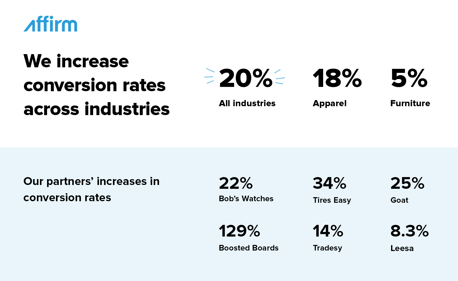
After implementing Affirm, businesses see an average conversion increase of 13.3 percent and one brand got an incredible 42 percent lift. And this was consistent across multiple industries. Tradesy, an apparel marketplace, saw a 14 percent jump in conversion. Online furniture brands averaged a five percent lift across multiple brands.

5. Have a clear call to actions
No one wants to be unsure when it comes to their money online. Vague submit buttons and puzzling language on checkout pages can make customers wary of completing a purchase. Instead of ambiguous language like “Submit” or “Continue”, make it specific—for example “Pay now” or “Complete checkout.” Any confusion about the result of clicking a particular button will result in costly hesitation and decreased conversion.
6. Invest in quick loading times
On all other pages, a laggy window is merely an annoyance, on a checkout page it can mean financial uncertainty. If customers have to reload or hit the back button to get out of the spinning rainbow wheel of death, they will be unsure if their payment has been received. Making sure your pages load quickly and have descriptive copy on the loading pages will make shoppers comfortable. Use a well known and well-scalable hosting platform that has enough bandwidth to support your site. Make sure your images are optimized and small enough to be loaded quickly. Using a content delivery network (CDN) will cache your site in local areas making load times faster around the world.
7. Send engaging abandon cart emails
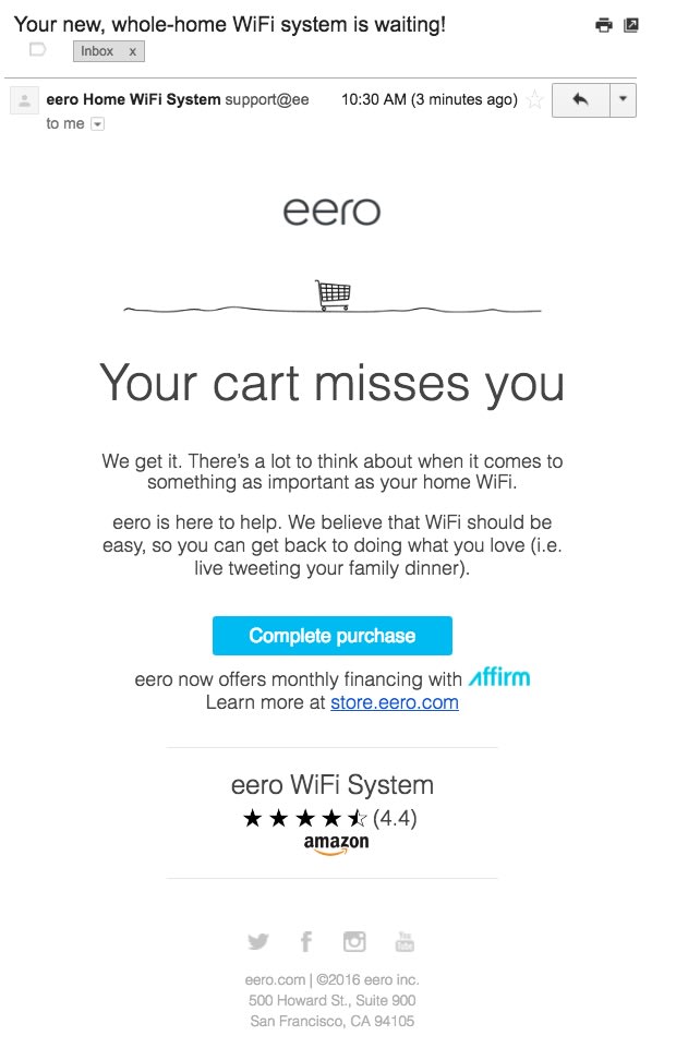
Abandon cart emails have become the standard to regain the 60 percent of customers that don’t complete the checkout flow. Rise above the 11,250 ads customers see a day by creating an engaging communication with your customers instead. If the price is a concern for shoppers, offer them an actionable solution such as a way to pay in monthly installments instead of a general reminder that they left something behind in their cart. Salesforce data showed retailers that created personalized cart abandonment emails resulted in a sale in 60 percent of cases.

8. Advertise free shipping and the return policy
In 2017, 54 percent of people said they didn’t complete their purchase because of expensive shipping, and another 39 percent didn’t complete because free shipping wasn’t offered. Make sure to provide and display this perk front and center. Also, promoting a comprehensive return policy will ease the minds of online shoppers, and guarantee they won’t have buyer’s remorse if the item turns out not to be exactly what they wanted.


